New logo announced for NAWIC

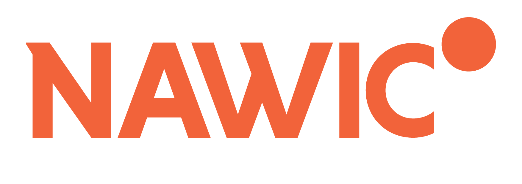
The National Association of Women in Construction (NAWIC) NZ has revealed its new logo and colour, effective immediately.
The NAWIC logo now utilises a strong typeface, with a little flick on the top of “N” and “W” which designers Attraction Studios says brings a “slightly feminine, definitely more fun aspect” to it.
“Concentrating on a word mark as opposed to an icon-style logo creates a [more] formal feel, while the levitated dot [offers] a lightened and uplifting impression.” The dot is used to symbolise inspiration, as well as the upward progression our members experience through participation in our organisation.
The new orange follows the current logo colour but shows a more modern and strong shade than previously.
“One of the things that was challenging about the last logo was the huge amount of text in it,” said NAWIC executive board member and Canterbury Chapter Chair Rebecca Hodges, who has overseen the rebranding. “It made it very difficult to use in a wide range of applications.”
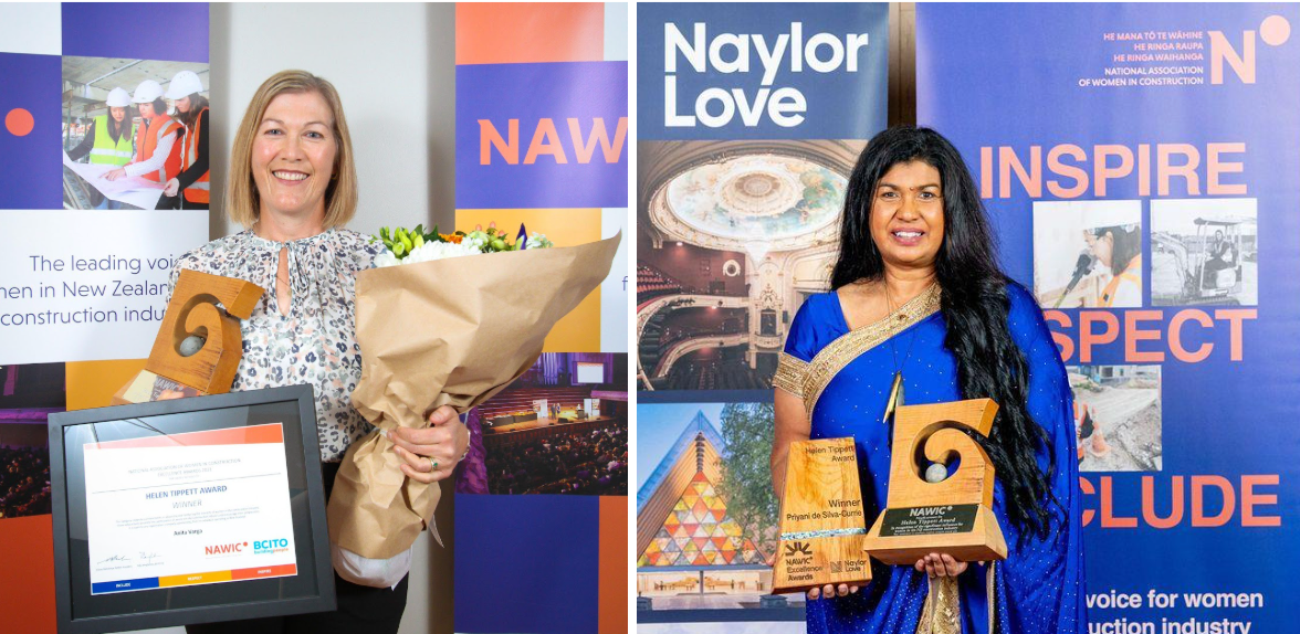
Look for the new logo on our website and on collateral for the 2019 NAWIC Excellence Awards (in partnership with BCITO), entries for which are now open.


